Showing posts with label design. Show all posts

Monday, 25 March 2013

Mobile Implementation Plan

It's almost time to start coding our  mobile  app! But we need an implementation plan.

The plan is -there is no plan. Or as we used to say diving -plan the dive, change the plan! Which is why I spent half an hour in the Port Napier sitting in a corridor waiting for the mud to settle on one occasion, and spent 30 minutes another time getting a singularly dull view of the bottom of the hull. Both times we missed the excellent dive through the middle of it.

Mucked it up twice and it's so big!


Both these times proper application of the 5 Ps would have resulted in a good dive, or even the ability to tell left from right on the second dive. That's Proper Planning Prevents Poor Performance to the uninitiated, for the initiated there's a sixth P -but this is a family blog.

Time for a plan then?

Well no, not a formal one anyway, it's easy to start planning too soon. I was working at GEC when the Nimrod AEW project collapsed, fortunately not for that bit, but £1 billion, in 1980s money! Part of the problem, I was told at the time, was the early specification of the hardware, and requirements that changed.

Anyway we're all Agile and Scrum now, we don't have plans we have backlogs, we don't have delivery dates we have sprints. So, in the spirit of Agile we'll start a product backlog and a sprint backlog although the latter will be pretty flaky as I don't know how much time I'll have to spend on this.

Or should we go Lean?

If I was in the day job, leading the team, we'd have a bunch of meetings to thrash out the product backlog with the rest of the business, playing by MoSCoW rules. Next we'd get together as a team, do the poker planning and work out what would go into the sprint. Since we're a self-managing team people would take ownership of tasks (unless I decided otherwise -that's what they pay me for.) and we'd disappear into our sprint.

But you know what? It's just me, I think we'll just have a list. Since we're at an early stage and just getting used to the technology we can start with :
  1. Get camera working from within app.
  2. Save image.
  3. Upload image (somewhere).
and that gets us to the holy grail of the Minimal Viable Product!

Friday, 8 March 2013

Mobile Scanners - The Competition

In this post we take a look at the competition. One of the drawbacks of the app stores is that there is an app for everything and sure enough it took seconds to find a couple.

CamScanner


Camscanner Screenshot


  • Scanning good, easy to use.
  • I don't like the layout of the home page.
  • Cloud integrated with their own cloud storage
  • PDF generated
  • no OCR, or if there is it's well hidden
  • Website so-so, nice and simple to the extent that it's using the back button for navigation, seems like it's a bit of a Beta.
  • App is missing confirmation here and there, e.g. pressed sync nothing happened. It did sync but I couldn't tell without looking on the web site.


Handy Scanner

Handy Scanner Screenshot

Handy scanner in play store
  • Basic scanning and sharing.
  • PDF generated
  • No organisation of documents
  • No cloud storage.
  • Simple but limited. 

Both of these apps do a decent job of capturing the image and doing some basic alignment and cleanup. With both you can easily share the document, that's the point at which HandyScanner stops. Camscanner carries on with some basic groupings, but they don't seem very helpful, you can add notes which is useful and missing from my app, but you can only tag on the website.

I think that this leaves me room for better document organisation and tagging and also for introducing OCR. That said, if you use Google Drive as storage it will attempt to OCR the document, although it failed with both my test examples.

Should I carry on, or give up and wait until Google runs our whole lives? Why is it not surprising their data centre software is called Borg, Orwell could only dream.

Mobile Design Patterns

despite my rant, I am here to design and build, (or rather build and design, since I'm a techie and not a fluffie) a mobile app so it would be good to look at some navigation patterns for it, with a view to stealing them.

We were pointed to http://www.mobiledesignpatterngallery.com as a source of inspiration and asked to pick out 3 relevant ideas.

Home Screen

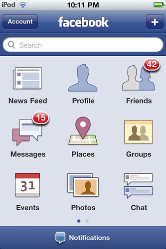
How about this for a home screen?
  • This roughly matches my idea for a home screen.
  • It might be better to split search from capture in the way notification and search are split here.
  • Use of colour and icons is good, even if the colours themselves are a bit insipid.
  • The numbers against the icons could represent documents stored against a tag for me.

Tabbed Screen

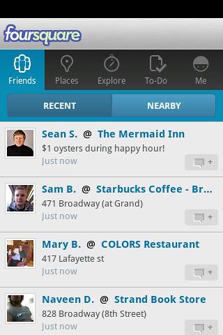
Listings
I hadn't thought of this, but it's a good way of expanding the desktop beyond the screen.
  • Could be good for listing tags and the documents belonging to them
  • Limited number of tags across the top but could swipe
  • Scroll down documents
  • We already had concepts of place and time in the original design

Search Results

Filtered search

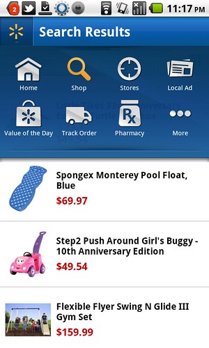
I thought this might do for the search results :
  • Icons would be tags allowing you to filter the search
  • Would anyone use it?
  • Techies love search driven sites.
  • Users only use Google.
  • Is it better than the foursquare screen, which could be adapted to the same job
  • Is the overlay too big, although what's underneath isn't what the user wants to see?

 Answers on a postcard please

  • Do users use the search in a mobile app? They don't use site specific search on the web.
  • Is swiping and scrolling going to make users of the tabbed screen seasick?

Thursday, 7 March 2013

It's just an effing phone -get over it!

I was supposed to write a blog post about mobile design sites -but when I looked at them my heart just died, these mobile designers have less interesting lives than trainspotters -a black turtleneck is the new blue anorak.

It wasn't cool when I bought it
As you can see from my phone, I may not be the best person to write about mobile design, it's old, it's bust, I spent 0s arranging my desktop and the only reason the background isn't the default is that my daughter changed it. In fact the only up to date thing about it is that Evernote got hacked last week.

What do I use my phone for ( compulsory list coming up ) :
  1. Making phone calls -your phone really should do this -please take note Apple.
  2. Sending texts, the soft keyboard is actually good at this, predictive text is brain dead in this version, the one on the playbook is much better.
  3. Browsing the web -of course not, it's slow and far too small, that's what tablets are for.
  4. Email ditto desperation only.
  5. Reading a book ditto.
  6. Listening to music -could do, but don't.
  7. Checking train times -something useful, at last! You can find out when your train should have been here.
  8. Stalking (sorry social media), not since the restraining order.
  9. Navigation -was good but the GPS has never been the same since I went up Snowden with the phone in an open pocket. It was Wales, it was raining, no need for point 10.
  10. Checking the weather -well I am British (and fiercely proud of it!)
  11. Angry Birds -was amusing for 30s. now please fire the lot into an erupting volcano. I am over 12.
So I went looking at these mobile design sites :

Tech mobile blogs:
Design Inspiration:
They are Dull with a capital Duh, just lots of screen shots of mobiles with apps open in them, compare that to what the trainspotter sees :

I think that's my brother!

So my media-bespectacled brethren, throw off your turtlenecks, embrace the nutty slack and get yourselves down to the nearest sidings before it's too late. You've probably got longer than you think, see point 7 above.


Should this post have raised any issues, or upset you in any way please feel free to comment below, there are charities which can help.

Friday, 1 March 2013

Balsamiq Mockups

Following on from last week's paper exercise we now get to create some working wire frames using Balsamiq. Balsamiq is a pretty good tool for doing this and can now export pdfs with links between mockups -which gives you a prototype you can drive. The only downside is that it's expensive for just playing around with, at $12 / month, although it's cheaper if you download the tool -or use the GoogleDrive plugin.


This is a minimal working version of the app -enough to allow uploading, storage and retrieval. Although I didn't carry out the heuristic exercise -maybe at the next meeting of the Likely Lads- I did find a few obvious holes, such as the lack of a home screen. In addition when designing this I noticed some inconsistencies in the interface that I will need to go back and fix.

Following Sam's feedback on the navigation, the usual Android nav. is 'assumed' -which means I was too lazy to link up the back button and the home button, I also forgot to link up the trash.

On the choice of icons vs. a one liner list, I decided that I could get more icons on the small phone home screen. In the actual app the home screen would preferentially display a category of items that the user picks, and perhaps the actual icon could change based on a primary tag?

In the real world I'd probably do both and A/B test, or have it configurable.


Monday, 25 February 2013

Storyboarding and Prototyping the Mobile Filer

Problem Definition

In last week's need finding post I came up with the, not particularly original, idea of a mobile filer, this week it's time to prototype that. The first thing we want is a point of view, a very high level problem definition :

I want to record or copy documents and other objects and file them so that I can easily find them.


Having a definition, we flesh things out with a couple of storyboards, at this stage we are still in the 'fail early' mindset -trying to get something that looks like it will work.

Storyboarding

I created two storyboards, showing the flow through the application.

First Storyboard
First Storyboard

In the first storyboard the user organises his files on a computer, this gets around the challenge of the small screen size  and the poor interface of the phone.

Second storyboard
Second storyboard
In the second version we accept the limitations of the mobile device, on a tablet these wouldn't be so bad, and do the organising there. This means that we do the job in one go.

Ideally we would be able to use stuff we already know such as the date and time, or the location or type of image, or stuff we can work out -perhaps via OCR to carry out much of the classification automatically.

Paper Prototypes

Ideal Input System
Ideal Input System
 The ideal input system above may look a bit facetious (moi?), but it serves to illustrate a point, if this system was smart enough this is how we would like the input to work.

Likely Input System
Likely Input System
A more likely system lets the user choose between our two storyboards above, if he presses 'upload' then the image will be filed immediately, and he will probably have to sort it out later. Otherwise the user can tag the image -default tags are time stamp and location.

Finding Notes
Finding Notes

To retrieve documents the user selects a category of note and drills into it. I have just realised that I need a way to move notes between categories, so there would be an edit screen in here too.

There is also an opportunity for a simpler output system, which I had better sketch up now.

Search based interface
Search Based Interface

In this version  the user gets a set of important (flagged?, latest?) notes up front and access to the rest of the documents is driven through search.


If I get a chance I'll put up a video demonstration -but life is getting in the way.

Monday, 18 February 2013

Needfinding

The task was to observe some people and derive a product by finding a need that they had.Unfortunately most of the people that I interact with regularly aren't suitable subjects -I had an idea based around homework, but understandably schools won't let you in to observe the pupils; the other idea was based around the elderly but similar problems arise and, in addition, there comes a stage where the new technology you are going to be picking up  is a Zimmer and not an iPhone.


Capturing a document
Capturing a document, need to share it


In my interactions with these two groups I did observe some tasks that I was carrying out, so I decided to use these for my needs. Both groups get documents that need to be dealt with, say homework for one and hospital appointments for the other, this generates a lot of paper, people need copies and all the usual. I found myself taking photos of these, as did my daughter -who promptly deleted it highlighting the need for off-phone storage, with our phones. So far so good, but the filing is where it falls down.

Document filing
Document upload and filing -there has to be a better way.
The document has to be got off the phone, one way or another, then filed somewhere locally or remotely and found again when you need it.

Needs and Goals

Here's a brainstorming list I came up with :
  1. Quick
  2. Simple
  3. Easy to use
  4. Documents are easy to find
  5. Categories
  6. Tags
  7. Date/time stamps
  8. Location stamps
  9. Safe
  10. Secure
  11. On hand -don't have to find a computer to access.
  12. Shareable
  13. Feature extraction for filing/tagging
  14. OCR for filing/tagging
  15. Social coz you have to
  16. Calender integration

Inspirations

Five things that might help define the solution :

The fridge wall of information

Important household information is posted in a known, obvious and prominent place.

Filing Wallet
Filing Wallet
The old school definition of organised, either alphabetically or, as this one is, 'tagged'.

Filing Clerk
Filing Clerk
Someone to get the piece of information you want. They may have their own system specifically tailored to where they work. Slobber extra.

It should be, one click is a bit of an ask but we need to get as close as possible.

Shiny, the app should look sleek and crafted -which will be a challenge for me.

Saturday, 9 February 2013

Brainstorming and Prototyping


This week's design exercise for the HPU Mobile course was around the beginnings of the process of delivering a mobile app -getting a concept and making a prototype.  A good introduction to this is in Scott Klemmer's HCI course.

Brainstorming

The challenge was to come up  with 20 things to do on your mobile whilst waiting in line, a crack brainstorming team of myself and the trainee woman was assembled and this is what we came up with.


Design Brainstorm 1
  1.     Gambling  (bingo, roulette, fruit machine)
  2.     Vouchers (did this one for real)
  3.     Find someone to have a coffee with
  4.     Browse Comics
  5.     Listen to Jokes (Professor?)
  6.     Local News & Events
  7.     Watch a clip (trailer, sports, music vid)
  8.     Gossip
  9.     Update Shopping List
  10.     Take a virtual tour.


Design Brainstorm2

  1.     Language learning -about item of shopping?
  2.     Play a game
  3.     Read Magazine (e.g. Hello! guess who?)
  4.     Diet program linked to your shopping
  5.     Styling app -beauty products on your photo
  6.     Test the Kids app. (for mums in the line)
  7.     Recipe for item of shopping.
  8.     Queue switcher -the other queue is always faster.
  9.     Interactive Story
  10.     This has been deleted for reasons of taste, let's say dating app.


Prototyping


The next step was to build two paper prototypes. Firstly, I chose the Queue Switcher - it's simple to explain, it's a bit like a game (come to think of it there could  be a collaborative Queue Racer version) and I haven't seen one before. Secondly, it was the Recipe maker -because when I am standing in the supermarket staring vacantly at the food shelves I could use one. It is one of the perennial problems of family life -what am I going to cook tonight?

It seems the Queue switcher does need a bit more explanation after all, it's based around the perceived wisdom that the other queue always moves faster than the one you are in. The app lets you track that and suggests when you should move queues, based on their relative speed -of course we all know that as soon as you leave your original queue it speeds up! Thinking about it now we could add in a bit of social allowing you to share the outcome and a bit of gamification -you too can be a 'Quintessential Queuer'!

Queue SwitcherRecipe App

User Feedback

Next step was to try out the prototypes on some users. I wasn't really up for buttonholing strangers in the street so I picked on the family :


Entering an ingredient
Generally they got the idea pretty well, but one thing I did learn is that it helps to screen your testers : My wife has never used even a feature phone; and the daughter doesn't really shop for food.

Recipe Dropdown
Recipe Dropdown

Insights Gained

  1. Better window titling to flag up what each screen is for.
  2. Error messaging would be needed.
  3. More interior navigation -having picked a recipe all the ingredients may not be available, so the ability to go back to the recipe list or the recipe search would be useful.
  4. Predictive typing would speed things up.
  5. The shopping list feature could just be a list, it was felt that the ability to tick items off, or remove items was unnecessary.

linkedin